


So what on earth am I doing writing an article about Windows 10? Why, for pity sake, is this post on a website devoted to Apple and their halo-istic (is there is such a word) products?
Well the answer to this is two fold. Often we need to install Windows on either a boot camp partition or a virtual machine such as VMware in order to run applications not currently available for Apple. And on that score I can put you out of your misery immediately, the answer is yes it’s fine. It doesn’t stall, it isn’t slow and, at least in my testing, it doesn’t mangle your favourite Windows applications. In short, it is a bit like Geelong… nice place to visit but you wouldn’t want to live there.
My second reason for bothering to discuss Windows 10 lies squarely with your friends. I am especially concerned, as I am sure you are, about those friends already using Windows. Those friends who, not knowing any better, might think that they should upgrade to Windows 10 rather than move to a Mac – despite your advice to contrary.
In this comparison I am going to focus specifically on what both Windows 10 and Mac OS X – in this instance El Capitan – offer out of the box, so no third party software will be allowed to muddy the interface waters.
General look and feel
There is no doubt that Windows 10 is a more complete interface than Windows 8 – which is a bit like saying that rabies is an improvement on The Black Death because in real terms all they have managed is to finish writing Windows 8 and call it Windows 10.
Gone are the schizophrenic journeys into Windows 7 and then back to Windows 8 depending on what you were doing, what preference you were trying to access or application you wanted to run. It was a lottery and all you can say in its defence is that it never allowed you to miss Windows 7 and those days when an operating system was consistent and user friendly – ish.
In Windows 10 one of the biggest selling points is that the Start menu is back, something they removed in Windows 8 and kept chained and gagged in the basement ever since – so hardly an innovation but welcomed nonetheless.
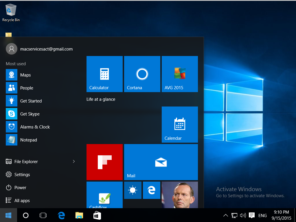
However clicking on it no longer gets you a list of our favourite applications or quick access to settings, but rather a lurching billboard of tiles – reminiscent of the Metro interface from Windows 8 – plonks itself all over the screen like a flag (if I can mix my metaphors). While this new menu is simple to use and to configure to your liking it feels like all they have done is to salvage something from the afore mentioned Metro interface that was so much at the heart of Windows 8. However one click and the illusion is shattered and replaced with a mere list of icons.
Perhaps you feel I am being a tad pedantic and perhaps I am but if you are going to have a theme I think it should be adhered too beyond a few clicks.
As for El Capitan, well it remains committed to the Finder, the Dock and now LaunchPad to access applications and settings.
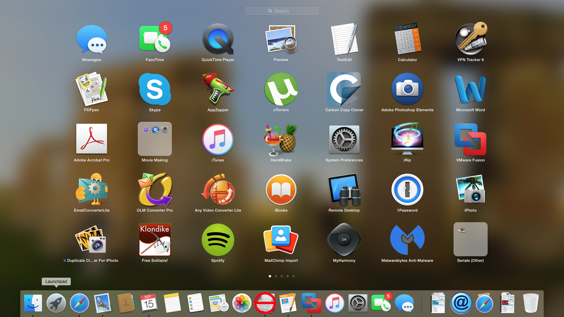
This interface is familiar to anyone who has used a computer in the last 15 years or anyone who has used an iPad or an iPhone in the last 5 years. Its warm and its cozy. It is a comfy sweater to Windows 10’s straight jacket.
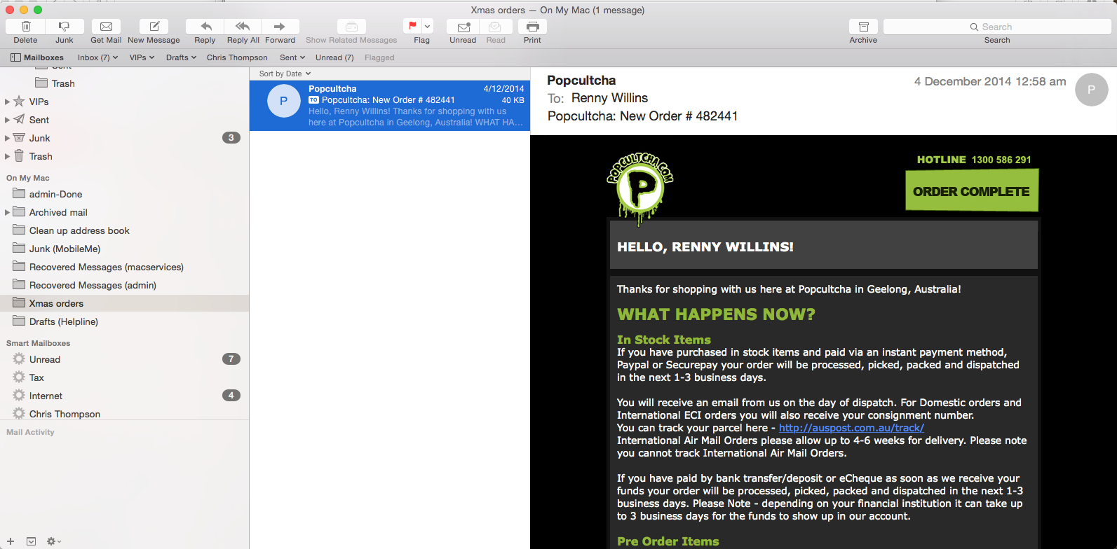
Email is central to us all and the El Capitan comes with a Mail application that is well suited to the casual user and has plenty in reserve for corporate servers like Exchange in the work place.
It is easy to use and has proven itself time and time and again to be robust and reliable. Easy access to formatting and built in stationary makes it the kind of built in application that makes you think long and hard about shelling out money for something else.
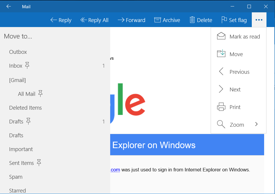
Windows Mail on the other hand is clunky, almost menu less (good luck finding how to create a Smart Folder or a an off line folder) and dull. Any task beyond creating, receiving mail or printing seems to be something best left to another application.
Browsing
Web browsing is definitely Tonto to email’s Lone Range or perhaps it would be more accurate to say they are conjoined twins? Regardless, I think it is fair to say that browsing is something users do with breathtaking regularity.
Windows 10 has received a major boost in the browsing market with Microsoft Edge replacing the buggy and often scorned Internet Explorer. Straight away you can tell that during development someone really loved this application because from the start it is obvious it was built to be used and be functional.
That is not to say it is without its oddities but more on that later.
As with all applications in Windows 10 it seems to launch – by default – in large screen mode taking every available pixel to flaunt its wares and while this is easily overcome it is tedious and unnecessary.
But it must be acknowledged that all the essentials are there. A common address and search bar – at the top rather than Windows 8 that thought it funky to put it at the bottom of the screen and hide it half the time – and bookmarks that are easy to create and manage. There are familiar forward and back arrows – for those that believe swiping between pages is the work of the devil – but for some reason the Home button needs to be turned on in Settings. Another tedious and unnecessary task.
I would go so far as to say that this browser, by and large, has everything that the average user of Safari would enjoy. However it falls down (or perhaps in this case just bumps into the furniture) in the design and function stakes. Lets take the Sharing function as an example and while we are at it the often over looked Reading List function as another.
While browsing you sometimes feel the irresistible urge to share the page with a friend either by email or sms. Or perhaps you want to post it for the world to see – again – on Twitter or Facebook. With Safari a simple click on the Sharing button gives you all of these options.


With Edge however you’d be forgiven for thinking that this function – beyond sharing via email or Twitter – had been left out altogether. It’s only after a trip to the Store and waiting five minutes to download the Facebook plugin that you get the ability to share via Facebook, to say nothing of sharing via text or the various other means offered in El Capitan.
Talk about taking the wind out of your collaborative sails! It reminds me of the days when you felt like watching a video only to be forced to sit there for 20 minutes waiting for it to rewind to the beginning.
My apologies to anyone younger than 25 who may be reading this and any distress that I may have caused.
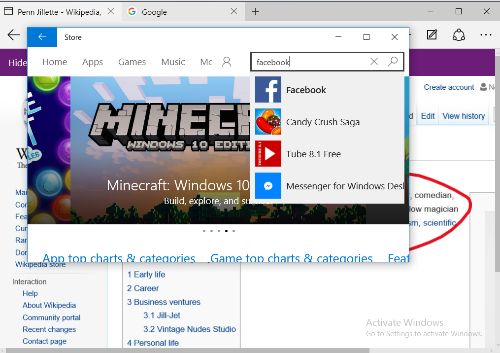
Once again a snack has been turned into a five course meal.
With an ever increasing sense that the designers at Apple sit down and talk to one another, the Reading List function is similarly functional and in the same location.

However, it must be said that Edge does have an interesting twist on this idea in that it allows you to annotate the webpage before committing it to the Reading list. Just why you’d want to do this – I mean isn’t this just a place to hold websites that you want to read and then discard later – is beyond me.

But even without annotation it is still a three click process to do what El Capitan does in one.
More tedium ensues.
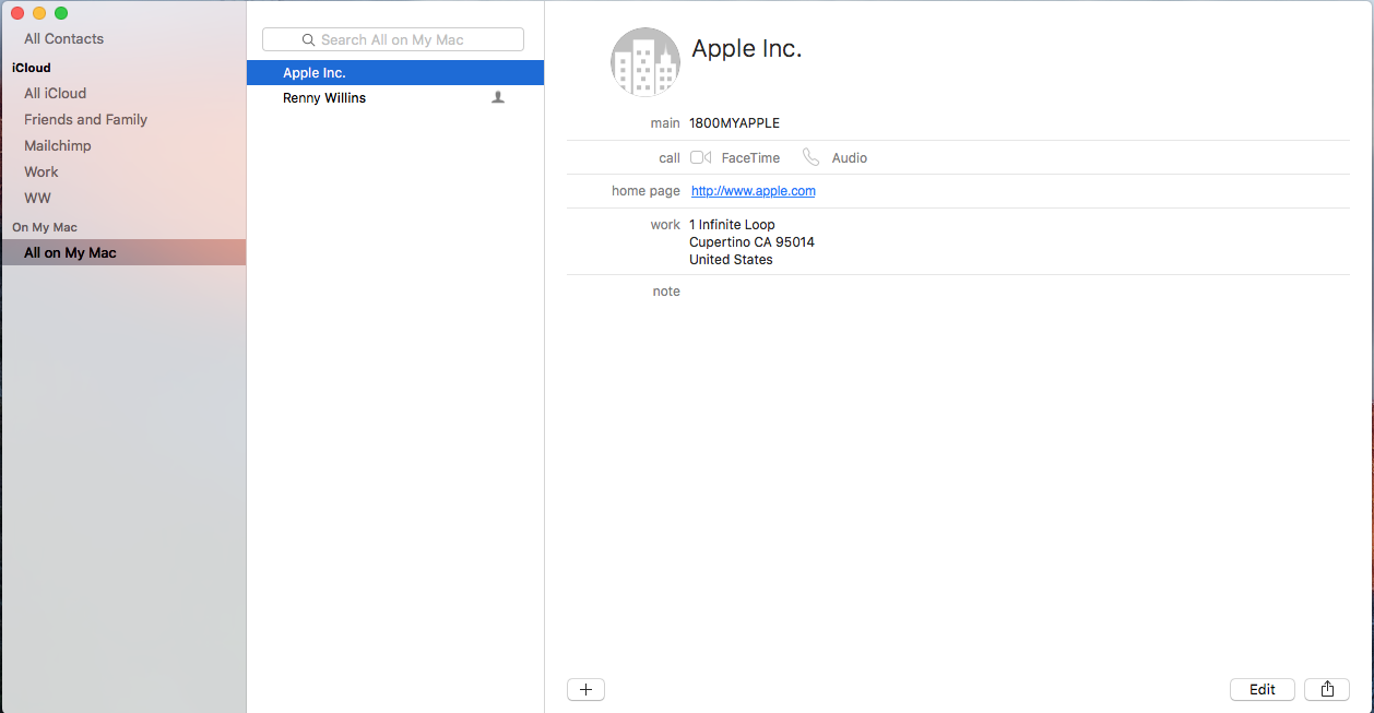
Address Book
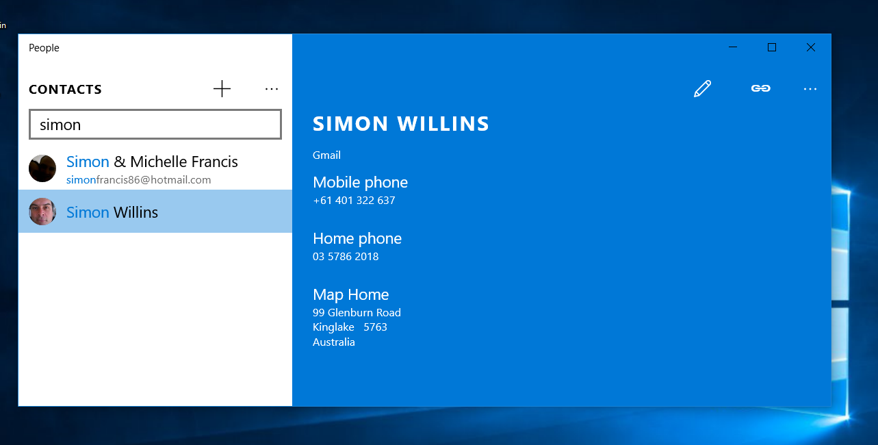
Both address books are clean and uncluttered which is a good thing.
Despite Apple Contacts looking sparse there is a fair bit of ability built in if you want it. Clicking on the persons address will you get the Maps application and directions. You can also send an email from the contact by clicking on their email address or a phone call by clicking on their phone number. The Windows 10 address book doesn’t have this range of function – and the Maps application is ghastly – but both address are likely the closest comparisons that can be made between the built in application suite.


So what else
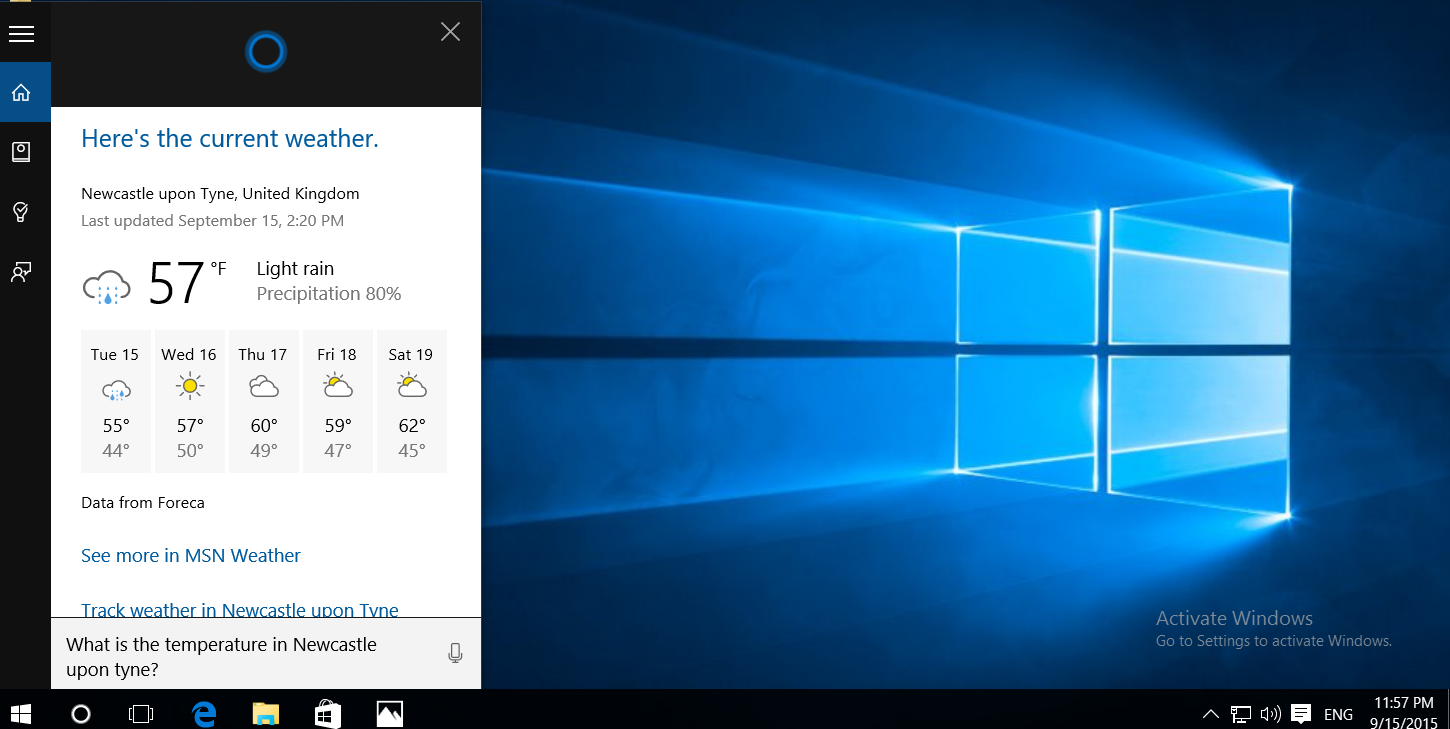
Both El Capitan and Windows 10 allow you to easily split the screen between two applications simply by dragging the windows to the edge of the screen. Windows 10 has Cortana – their Siri alternative – built into the desktop OS – something El Capitan most certainly does not have.
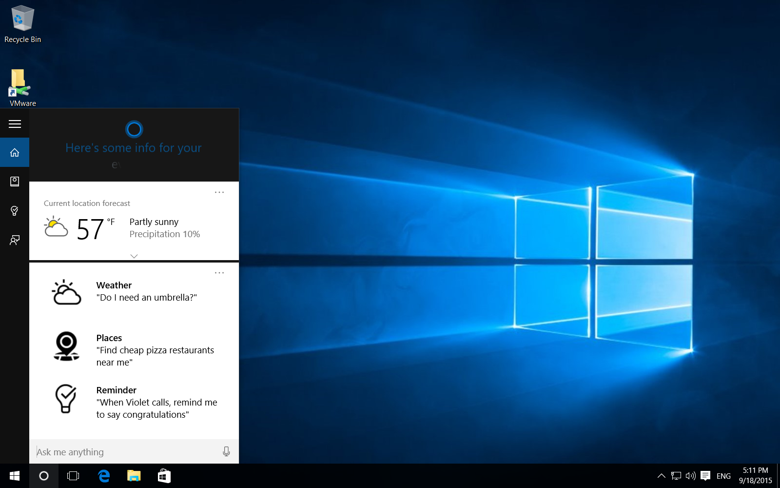
With Cortana you can ask it – or is it “her” – to open applications, remind you of events or make calendar entries. She can also do searches that span not only the computer’s stored wealth of knowledge but the internet as well.
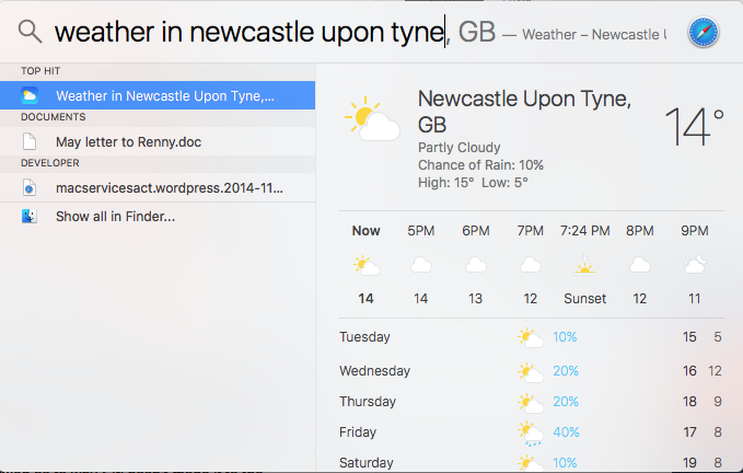
El Capitan has similar functions in the new Spotlight but again this is strictly via the keyboard.
Cortana is definitely cool but because it is not a phone – meaning the mic is not right up to your face – it is going to suffer at the hands of office background noise. Plus, and I don’t know if this is just version 1 jitters, but give her any task that falls outside the rudimentary and she just offers up a Bing Search page instead, almost with an apologetically shrug. I cannot help wondering if you are going to be spending as much time and effort closing the browser as it would have taken to do it manually.
Windows 10 does come with Solitaire but when I tried to play it I was forced to launch and sign up to Xbox? For Solitaire! Seriously! I feel like the proverbial hammer has been introduced to a unfortunate proverbial fly. By the time I was permitted to play I wanted to play a card game no more than I wanted to nail my head to the sideboard.
Photos
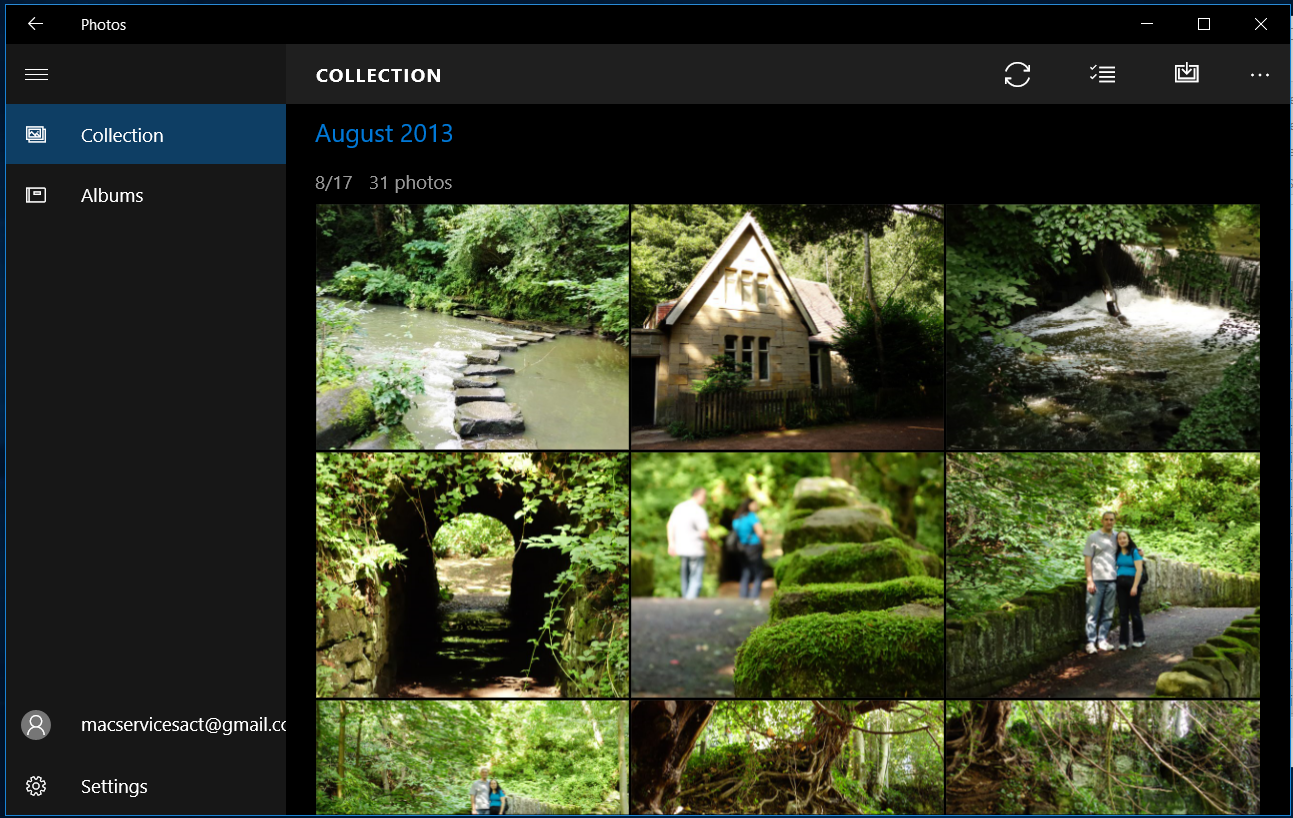
El Capitan comes with Photos and with this you can easily manage, edit and share photos as well as create cards, books and calendars.

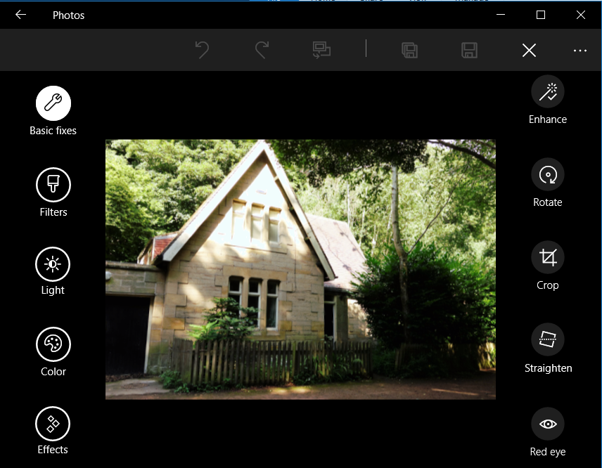
 Windows 10 has a Photos application but the menus are – and this is getting to be a broken record – illogical. The enhance feature, which is a form of edit, is separate from all the other editing features. However, once this oddity has been fathomed, its business as usual.
So do I hate Windows 10?
Well you’d certainly be forgiven for thing so but no I don’t, honestly. It is a fine example of Windows but would I want myself or my friends to suffer its half baked features and frankly bewildering interface choices for anything more than a few minutes?
No, and neither should you.
