

Big Sur has finally been released and, as is always the case, it is worth making sure that all your applications will work or at the very least can be easily upgraded or updated before you even think about installing.
While you are thinking about whether or not to update, (and I note with delight that some of you already have without issue) let us cover off a few things that I have noticed since installing it on my 2014 iMac.
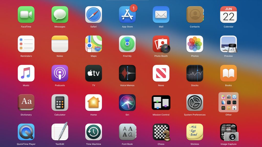
The icons in this update are, shall we say, polarising. Nearly all the Apple applications have received a refresh and while I am getting used to them (as I am sure you will also) they are nearly all on the ugly side. They look like I designed them… and that is never a good thing.
The windows in Apple Mail look washed out and the icons for the folders, mailboxes and functions are too small.
The aforementioned menus curiously don’t line up some times and I cannot for the life of me figure out what the reason might be.
The Maps application has received a lot of attention also bringing it into step with the iOS version. Cycle tracks and even more detailed info about cities and what they offer is now front and centre. The Look Around feature (Street View to Google Map users) is awesome but only available in some US cities. Perfect I guess for when you plan your next trip to the US in 2045.
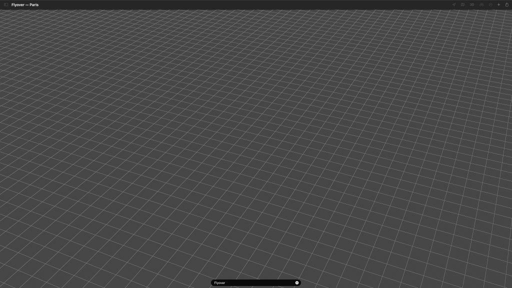
What is more inclusive of this country is Flyover where the maps takes you on a birdseye trip over a city of your choice. Curiously the flyover of Newcastle Upon Tyne doesn’t feature the iconic bridge and Canberra is just reduced to a featureless grid pattern after a few seconds. Anyone who has seen the movie TRON will know what I mean.
So by this stage you must be wondering if this update is any good? Wondering why I installed it at all and I am sure you think I am regretting it.
Well, no. You see in 1997 Apple released MacOS 8 and it changed for the Mac.
The icons seemed 3D when compared to flat icons used unchanged since 1984 and I remember plenty of people saying how ugly they were then.
The colours were bold, the desktop could now include our own photos and new smarts meant virtual memory could be used to improve performance and this was sorely needed because all this flash came with a performance hit.
It was different and scary but it was also magical. Suddenly the tired old SE or SE/30 (the iMacs of the 1990’s) was given a new lease of life.
Again, in 2001, MacOS X was born and this interface was again bold, colourful and dripping with technology and features that Windows was still trying to get right 17 years later. Even then, people said it was butt clenchingly ugly, slow and gimmicky but it paved the way for the next 19 years of MacOS… something we have all come to know and love. Something we all know is more consistent, polished and friendly than any other OS out there.
Since then however the operating systems have been…well, how shall I put it… conservative and have only built slightly upon the advancements of the previous years.
Some have added more shading, the dock has gone from a glass shelf to a meaningless strip along the bottom of the screen and there has been some interesting features here and there but essentially they have all looked the same. In fact, in recent years, the only thing that tipped people off that they had upgraded is that some of their applications no longer worked.
That all stopped with the release of Big Sur, MacOS 11 because everything about this interface is different.
The rounded dock icons, the rounded corners of the windows and dialog boxes are designed to look like your iPad. The sounds are different as well and while this might seem like a minor thing the default error tone is soft and friendly. It is a polite cough as opposed to a slap in the face.
When you pull down a menu they seems to float on screen as does the dock.
It is all very airy and light.
However it is not all just window dressing, there is some tech under the makeup.
Safari is faster (in fact the whole Mac feels faster) than ever before and it now has built in security monitoring that will inform you what trackers (if any) were blocked when you visited the web site. There is also built in translation as well so if you land on a website that is in a foreign language – American for example – you will be prompted to translate it into English with a touch of a button.
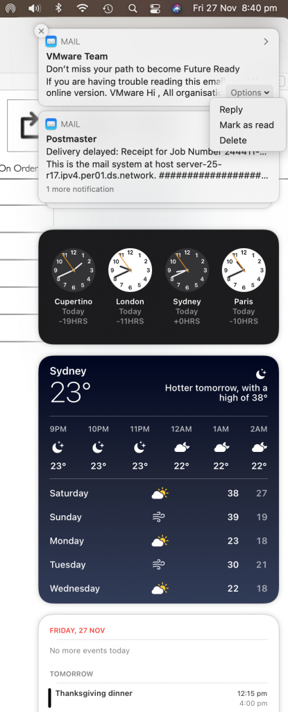
The Control Centre (in previous versions it was three little lines in the top right hand corner of the screen you never used) has been vastly improved. For starters it looks like the Control Centre on your iPad and all the main functions are there and easy to access in most cases reducing the need to go hunting for System Preferences. It also houses the Notifications and these allow you to do a whole lot more than before. Not only can you reply to an email or Message but you can mark them as read or delete them.
So all in all its a great update to apply to your Mac and while it might have some oddities and some ironing out I still think it is one of the best updates to come out in years and well worth a try.
