

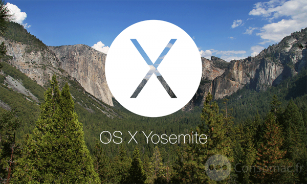
If you are running Mavericks and with Apple supporting hardware all the way back to 2007, it’s really not a question of if can you upgrade to Yosemite but rather would you want too?
About now I bet you are wondering why I would even question an Apple upgrade. Surely its faster? Surely its zippier? Surely there are new and exciting features just bursting to get out?
Yosemite is faster and it is zippier – thats all true. But what is also true is that many of the really cool features like Handoff and instant Hotspot will only work if you have – pretty much – the latest of everything Apple. Your Mac cannot be older than 2012 and your iPhone has to be iPhone 5 or better. But that’s not what worries me because if you want those features then its probably time to upgrade anyway, no my issue is purely cosmetic.
I have to be honest and say thats it is not a cosmetic issue that is going to stop me from upgrading because I can get around it with some fiddling and a few choice applications. But just before you start that download I would like you to be aware of two aspects of the new update that might make you gag once the upgrade has finished and you see your new Finder for the first time.
THE ICONS
I said a few months back that the new icons were breath-takingly, overwhelmingly, stupendously ugly. I felt that the new Mail icon was misshapen, the Finder icon clownish and the System Preferences icon – for one – seemed out of step with the design and looked unfinished. I ended the article with a hope that these were ‘place holders’ until the final release. I also remarked that deep down I suspected this hope was actually hopeless. Sadly I was right.
No one else seems to be commenting on these so maybe it’s just me but I think it’s worth looking at these and making your own mind up before it is too late. But one set of icons that a lot of people are raging about seems to be the folder icons. And yes, for the record, I think these are ugly as well.
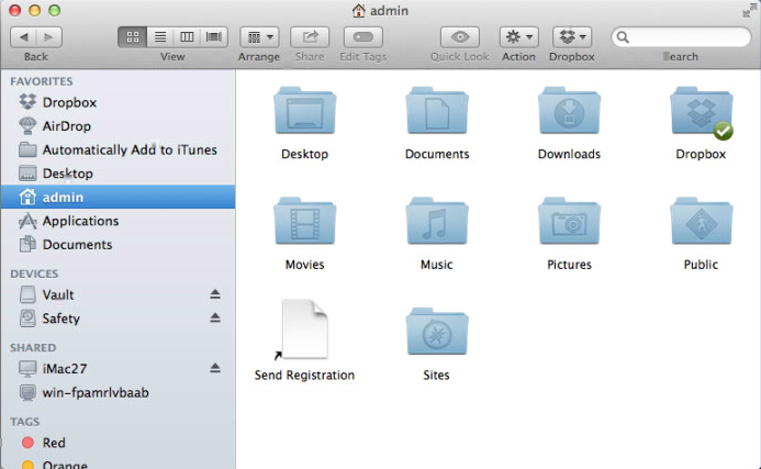
OLD FOLDER ICONS
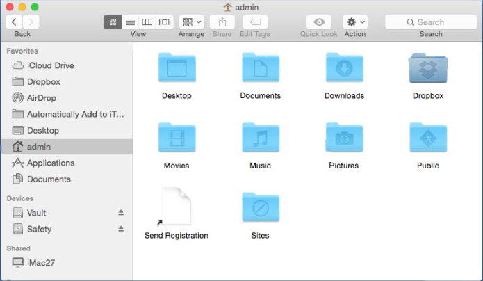
NEW FOLDER ICONS
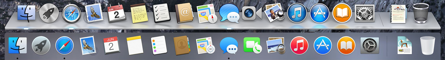
DOCK
The dock has changed as well to something more like what it used to look like in 2000. Gone is the 3D, glass shelf look, for a flatter ribbon shape. Its not something that bothers me all that much but it can be a bit of a shock when you first see it.
This image, from Reddit, probably illustrates this point (and the icons I mentioned earlier as well) the best.
Yosemite is definitely a faster OS and, if you have the latest stuff, has some great features that will close more of the gap between your Mac and your iOS devices better than ever before. Just be ready for the new look.
Now, I am off to look for a set of icon replacements.

1 comment
Thanks Renny
I wasn’t sure whether to upgrade or not and after reading your article I think I’ll stay with what I have as our iMacs are manufactured late 2009.
Kind regards
Peter