

Come Spring Apple will be unleashing their latest operating system, Yosemite–and with it will come the usual questions and hand wringing.
What’s going change? How will it affect my Mac and will I have to learn how to use it all over again? Is my Mac ready?
The good news is, at least at this stage, there is very little to fear and a lot to look forward too.
I installed the beta 1 copy on my Mac and while not everything works as it should, and lets face it how could we expect it would, you can already see that the new operating system is going to be a joy to use. Mostly.
This latest refresh has definitely been influenced by the flatter cleaner lines of iOS7 (and iOS8) in an attempt to blur the lines between using your iPhone, your iPad and your Mac. This frankly unexpected move started last year with Mavericks and the introduction of companion applications that mirrored the functionality of their iOS7 brethren. You could create reminders and notes and they would appear on your iPhone or iPad via iCloud. You could look up map locations and send the directions to your phone and sharing your thoughts via Twitter or Facebook was just a click away. Yosemite maintains all of these functions and enhances them further.
In another attempt at “cleaning up” the MacOS the system font has been changed to something thinner and lighter.
BEFORE
AFTER
The frames of the windows are also flat and simple but not in anyway austere.
BEFORE

AFTER

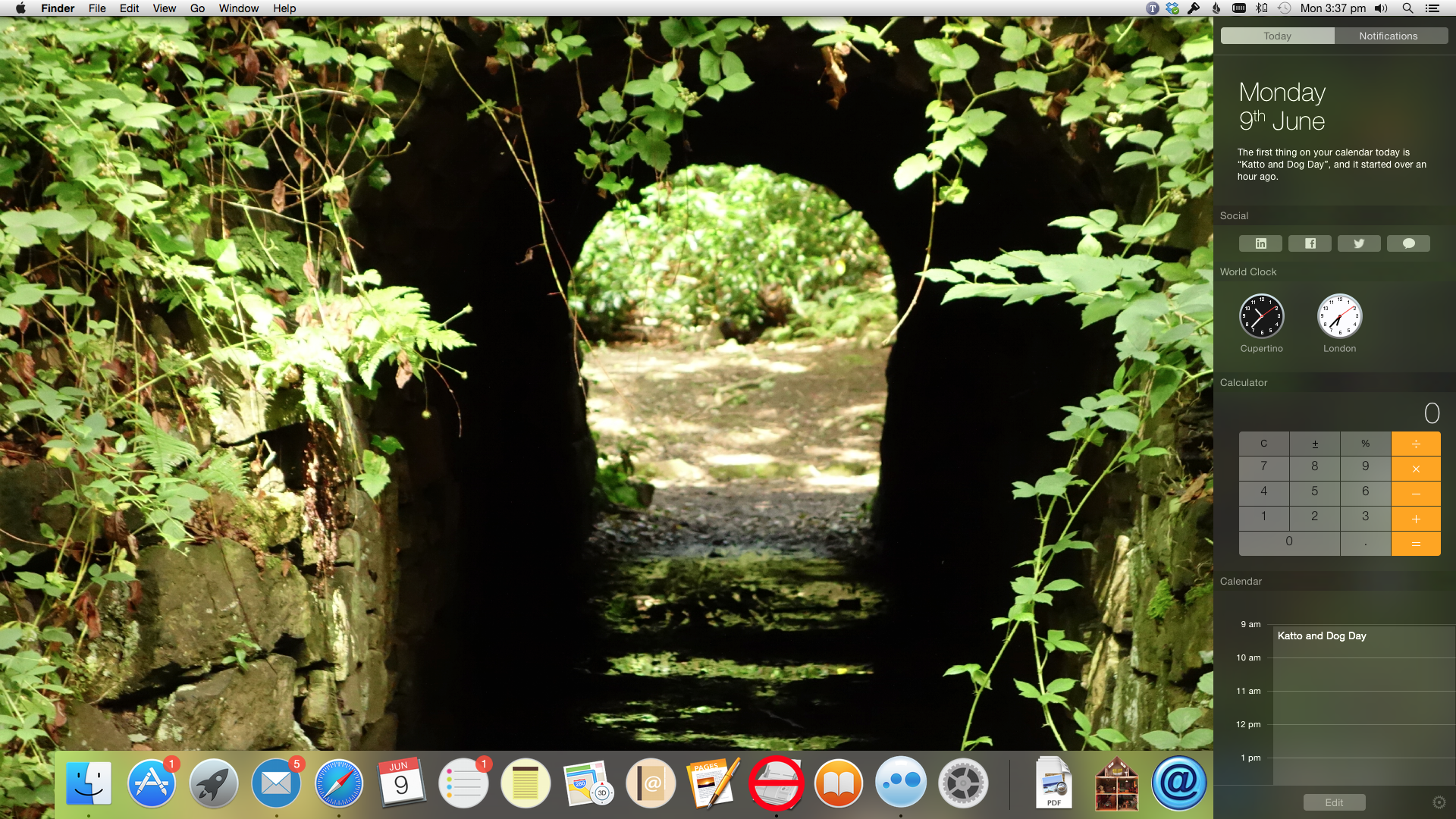
Notification, that funny icon in the far right of the screen – you know, the one you never use – has been given widgets that allow you to add the calculator, world times plus more. This makes it somewhere you might actually want to go.
BEFORE
AFTER
Spotlight has been dragged from appearing as a tiny little dialog box in the top right hand corner to a whopping great panel in the centre of the screen. More info, more purposeful and smarter as well giving you information from your Mac, the web all at once.
BEFORE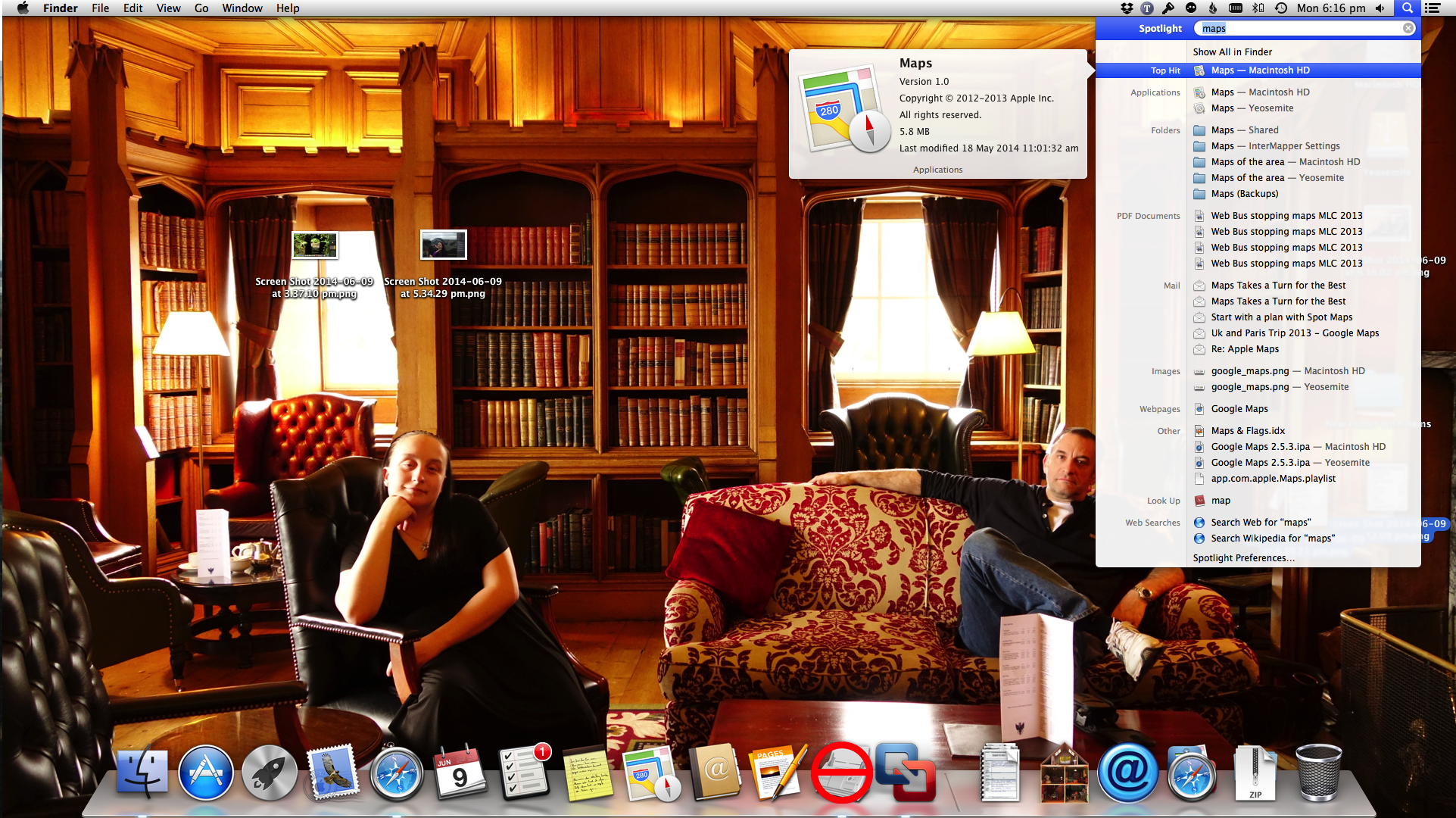
AFTER
 With the exception of some fixes under the bonnet, Mail looks pretty much as it always has but now the with the new Markup feature you can draw and annotate files inside your emails before you send them which takes a number of steps and some guess work out of adding contents to photos.
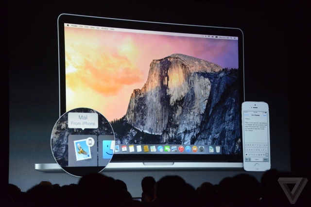
Possibly one of the best new features is a function called Handoff and this one really does blur the lines between Mac and iOs device without, I am glad to say, turning the MacOS into a giant iPhone, ala Windows 8. Handoff allows you to finish a message or an email, web browsing or document that you have already started on your iPhone or iPad and continue it on your Mac – or visa vera.. Imagine this… You are at work, getting a coffee and you start an email to a colleague. You are halfway though the email when you sit down at your Mac. With Yosemite running, by now you would have noticed a little icon of a mail message appear to the left of your dock. Now all you do is put down the phone, click on the icon and you are instantly plonked into Mail to finish your email where you left off. If Steve where around he would have said that this was magical, and he’d be right.
And not only that, but if your phone rings in the other room, the call will appear on your Mac screen and you can take the call right there.
So with Yosemite running on your Mac it will look familiar, work the same but will have a heap of new features that will make life simpler and a tad more productive. Even fun again. I am happy to report that nearly 100% of my applications, utilities and interface enhancements worked just fine under this new order. Even my printer which has got to be close to 150 years old was happy to work.
Generally if you are running 10.8 or 10.9 now you should have nothing to worry about and the latest info seems to suggest that it will run on a iMac built in 2007.
But I am afraid there is one elephant in the room and I am sad to say it is a particularly ugly elephant. I am, of course, referring to the new icons.
In a word, they are appalling.
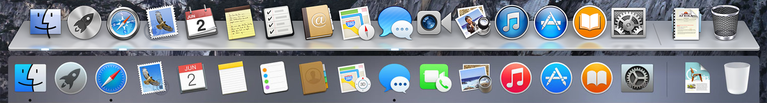
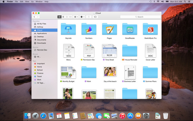
As you can see the dock is now 2D and all the icons have that flat, textureless look. But none of that bothers me. What bothers me are the dimensions of the icons, specifically Mail, Contacts and Calendar. They look deformed and unbalanced but worst of all they look like I designed them. In the meantime I have added my own icons and in my humble opinion they look a lot better and right at home. I hope Apple read this 🙂

Failing this I am holding out hope that these are simply place holders. The designers are saying to us “don’t worry, they are serving a purpose now but we’ll fix them before the curtain goes up.”
But I thought that about some of the icons that came out for iOS7 and look how that turned out!

1 comment
New UI is ugly as hell!
I hope there’s some way to turn back into the old 3D skin.