 There is something happening to desktop interfaces on both sides of the divide and I am not sure I like it.
The push seems to be the interface used on smartphones – the ones that rely on touch screens and finger swipes – is to be shoehorned onto the desktop.
It was Apple, in 2007, that introduced the interface eventually labelled iOS and while this is- rather unfairly- describe by its detractors as a “mess of icons” is simple and it did result in an unprecedented acceptance of this approach and reinvented the mobile phone.
No matter what else you might hear or personally believe, iOS is continuously described as easy to use and “gets the job done” so a mess of icons or not it seems to be the way millions of users prefer to use their phone. Also, as the Android interface is nothing better than a weedy and ill-conceived copy of the iOS, it could be argued Apple’s vision covers over 90% of the smartphone market.
Microsoft, on the other hand, decided to take a different approach and designed Windows Phone 7. A tile themed interface that sought to infuse your life (calendar, contacts, and data) with social media and the web. This was – and is – a bold move and a welcomed change from them just following Apple’s lead (see Windows 95, Windows XP, Windows Vista and Windows 7) but this approach is yet to prove a hit with anyone outside of Microsoft employees and their friends. However this little fact hasn’t stopped them pushing ahead with a new operating system that could be perfect for a tablet but disastrous for their desktops users.
But more about that later.
It is worth remembering the iPad and iPhone make up more than 70% of Apple’s extraordinary profits so Apple could be forgiven for thinking this interface is a winner and more of it should be included in the MacOS. So it didn’t seem like 5 minutes before we started seeing touch pads (the so called MagicPad) and the Magic Mouse appearing for the Mac so desktop users could pinch, swipe and zoom-in just like they did on their MacBooks and iPhones. This was OK for us desktop jockeys because the ability to swipe and pinch could largely be ignored and we could treat it more like a feature than a shift in mindset.
The alarm bells weren’t ringing.
Then along came Lion with its ‘natural’ scrolling and Launchpad, both of which deserve a special place in hell as far as I am concerned.
But I am jumping my own gun.
In fact I would argue “Natural Scrolling (the act of scrolling up with your finger to scroll up the screen) is actually UNnatural when using a mouse with a screen at arms length. In my experience this was the one feature that was turned off just as soon as people figured out how.
But that was the past. What does the future hold?
Later in 2012 Apple is releasingMountain Lion and the next and “newest” OS for the Mac. While it is unquestionably quicker and is more closely integrated with iCloud I cannot for the life of me see why they think it is worthy of the title “new” or how they will justify charging for it.
As expected Mountain Lion seeks to further mix the desktop with the mobile with an unarguably sleek integration of Reminders, Notification Centre, Messages, Share Sheets and a whole lot more iOS inspired features. Launchpad too has been given some treatment but not nearly enough to dissuade me from wanting it dead.
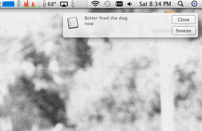
Notification Centre first appeared on the iPhone and iPad in IOS 5 and is a shameless rehash of the notification feature found in Android. This feature – which seeks to bring the same experience to the desktop – comes as a little round icon in the top right-hand corner of the screen. While it can be accessed with a swipe command – should you be using a MacBook or with one of those aforementioned trackpads – it can also be brought to bare with a simple click of the mouse. With a clean and smooth animation the desktop slides slightly off to the left revealing the events pending that have, effortlessly, synchronize between your iPhone and your desktop via iCloud.
Creating new Reminders to add to the list can be done via the Reminders application which is identical in every way with the App found in iOS.
Another simple click or swipe and your notifications disappear.
If something does need to grab your attention while the Notifications pane is hidden a discreet dialogue window appears in the top right-hand corner. But anyone who has previously used Growl will see this as nothing new.
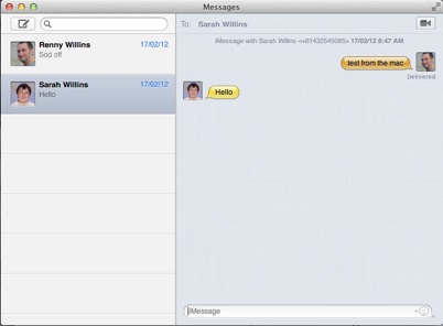
A messaging application has been available on the Mac for many years in the form of iChat but this application really was something of a “members only” affair as most of the people you could easily chat with had to be iChat users as well – in other words -Mac only.
While it was true you could chat with people using Google messenger, Yahoo or AOL none of these were particularly easy or rewarding to do so most people opted to use something like Skype instead.
Messages does have the advantage of allowing you to start a chat on your Mac and finish it on your iPhone or iPad but you are still largely limited to working with Apple devices. Text and video chatting with other non-Apple clients is still clunky and even my attempt to video chat with an iChat user interstate failed dramatically. As it stands at the moment this application does seem to have some promise but we will have to wait and see.
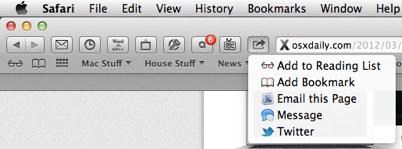
Sheet sharing – a feature that I am sure the hippest and the coolest iPhone users would undoubtedly know all about (I am not one of them of course) – has now been brought to the much improved Safari in Mountain Lion.
Now–should you be motivated to do so–you can easily send a web page as a tweet or as an e-mail attachment.
The new Safari also removes the google field and instead uses the integrated address field and search function ala Chrome and the impending Internet Explorer 10.
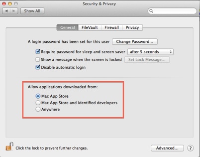
As well as these obvious tinkers with the interface Mountain Lion also has many new features under the bonnet that improve security and privacy. Perhaps one of the most obvious of these would be the new Gatekeeper system preference that can–depending on your level of paranoia–prevent the installing of any application unless it come via the Mac App Store.
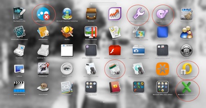
As I alluded to before there has been a couple of changes made to launchpad. That pointless overblown, unusable and inconsistent desktop application still doesn’t allow us to customise which applications appear. Forcing us to navigate through hundreds of support icons (Office 2010 has a lot of these) that should remain hidden. The best thing that can be said about this blight is that Mountain Lion now gives you the ability to search for the application you want. Big deal!
I pray to God this monster doesn’t eventually replace the dock.
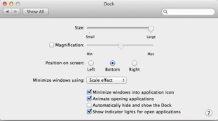
There isn’t really anything wrong with this new version of the Mac OS aside from the fact there is very little new about it. If Apple really wanted to call this a new operating system couldn’t they have taken this opportunity to include a proper Uninstall application or revamped the dock or perhaps injected some life into the built-in voice activation and voice control feature. Or what about adding a better password manager or even a re-worked Disk Utility – a program that hasn’t changed very much in years?
Perhaps I am being a little too demanding and maybe people don’t want these things changed. Perhaps they are perfectly happy with the way things are? Maybe as this is a developers preview many of these things will come after all?
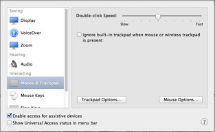
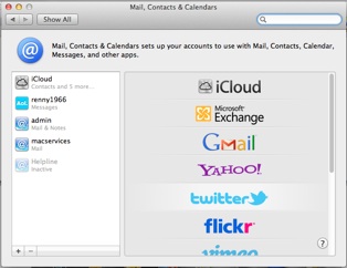
However one thing that cannot be excused is the half hearted approach to the re-designing of the System Preferences. Admittedly this is a small thing compared with the disaster of Windows 8, but nevertheless Apple have set about redesigning Preference panes to resemble iOS and as if this wasn’t bad enough they fall short of doing them all, plunging the interface into a new era of inconsistency.
This sloppiness makes this a hybrid which is a word Nissan used to describe a car that was neither one thing nor the other.
I can see why Apple think merging the interfaces is a good idea and thankfully- so far- these changes have remained mainly cosmetic or ignorable. This doesn’t make the trend any less nerve jangling or misguided and it only adds bitterness when they mix and match the look of the interface willy-nilly.
MacOS is what it is, iOS is what it is and all is right with the world – for now – but not for Windows users I fear.
And this leads me- seamlessly I hope- to the new Windows 8.
Before InDesign took over the world of graphic design the application of choice was called Freehand. When I first used this program to design a poster it quickly became obvious I had about as much artistic talent as a rock lying at the bottom of a swimming pool. In fact it is fair to say I am so artistically challenged I cannot even paint a door or a wall a solid colour without it looking naff. Yet when I first fired up Windows 8 it honestly looked as though I had designed it.
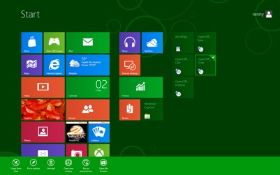
Large blocks of solid colour sitting atop of the less than inspiring backdrop was the interface that I was presented with after logging in past the worlds blandest logon screen since DOS. The icons looked like the kind of thing a pre-schooler might achieve with a potato stamp dipped into some poster paint. But oddly they seemed right at home!
Going deeper into the operating system I was presented with larger portions of minimalism bordering on the dull and and while I fretted looking for something simple like the Run command I was reminded when I used Windows phone 7 late last year.
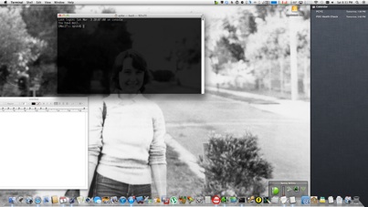
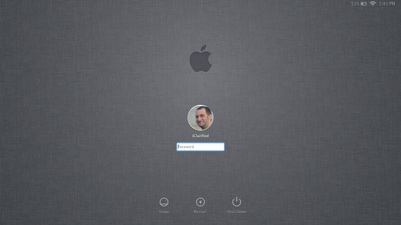
Mountain Lion Login Screen
Windows8 Login Screen
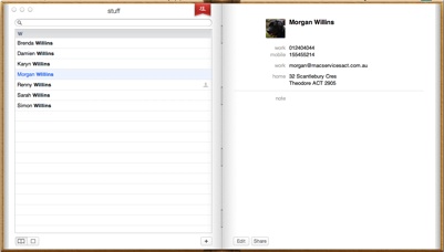
Mountain Lion Address Book
Windows 8 Address Book
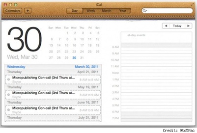
Mountain Lion Calendar
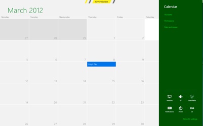
Windows 8 Calendar
Of course this is Microsoft’s intention and I standby what I said when I reviewed Windows Phone 7 – that while this interface is intriguing and different it’s not a very nice place to spend a few hours on a computer.
My biggest problem is not with this new interface, partly because it is new and different, but more the massive inconsistency in the way it is executed. As a user you are dragged from one interface style to another with very little to tie them together. It looks for all the world like the designers decided some things were too hard to “Metro-ise” and just relied on a Windows 7 look and feel to get by. Close enough was, it seemed, good enough.
At its core Windows 8 is a touch interface destined for tablets and phones. It seems Microsoft is paying less attention to the desktop user and instead their gaze is fixed solely on mobile devices. This is not unlike Apple and their Mountain Lion but it takes a step beyond that because their desktop interface is actually uncomfortable to use with anything other than a trackpad or your finger.
Different things in life have different methods of being used. Normally these methods – or interfaces if you like- are developed over time and become suited to the task at hand.
Generally they are different and for a good reason.
I know, for example, I don’t want handlebars in my car or oven knobs on my iPod.
And I think I don’t want to be forced to have a mobile inspired interface on my desktop computer.



Recent Comments